
The Via Nova mobile app
Role: Solo designer. End-to-end design for a self directed UX course project, covering research, journey definition, interaction design and interface execution.
Remote
2024-2025
Via Nova is a next-generation mobility service designed for clarity, speed and control. It offers a streamlined digital rental experience built on transparency, intelligent guidance and user confidence.
Project overview.
This case study explores the design of Via Nova, a car rental mobile app build around clarity, confidence and decision-making. The project was informed by user research, competitor analysis and usability testing.
The objective was to identify friction points within the car rental booking journey and design a solution that reduces the decision fatigue and builds trust throughout the process.
Problem statement.
How might we create a car rental booking experience that reduces uncertainty, simplifies decision-making and strengthens user confidence?
Research & insights.
User research focused on how people currently book rental cars and where breakdowns in understanding or confidence occur. This included competitor benchmarking, heuristic evaluation, and usability testing.
Key insights surfaced:
Vehicle overload - long result lists caused hesitation and uncertainty.
Filters and navigation - controls were difficult to apply, adjust or reset.
Unclear terminology - industry language created cognitive friction.
Age requirements - users did not understand why age affected eligibility or pricing.
Insurance opacity - uncertainty around what was covered led to mistrust.
Mileage guesswork - users struggled to estimate their needs in advance.
Start screen success - a simple, search-first entry point consistently supported flow.

Design goals.
Each design goal was drawn directly from a research insight, translating observed friction into a concrete target for the redesign.
Enable users to select a vehicle faster, reducing the effort required to evaluate options.
Provide intuitive and transparent filter controls.
Use plain language instead of technical jargon.
Clarify why key information is required, such as age eligibility.
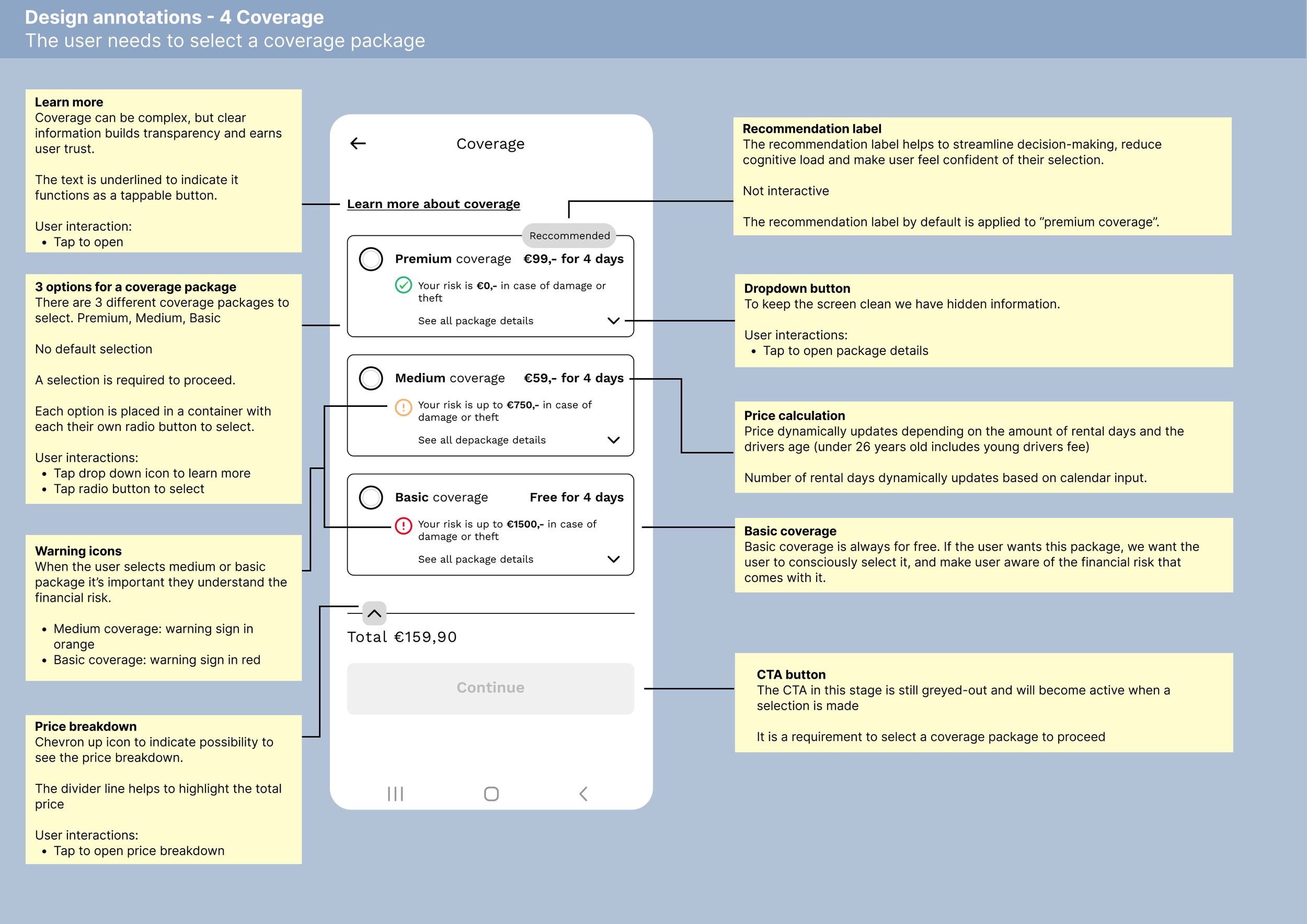
Make insurance coverage and extras transparent, showing clearly what is and isn't included.
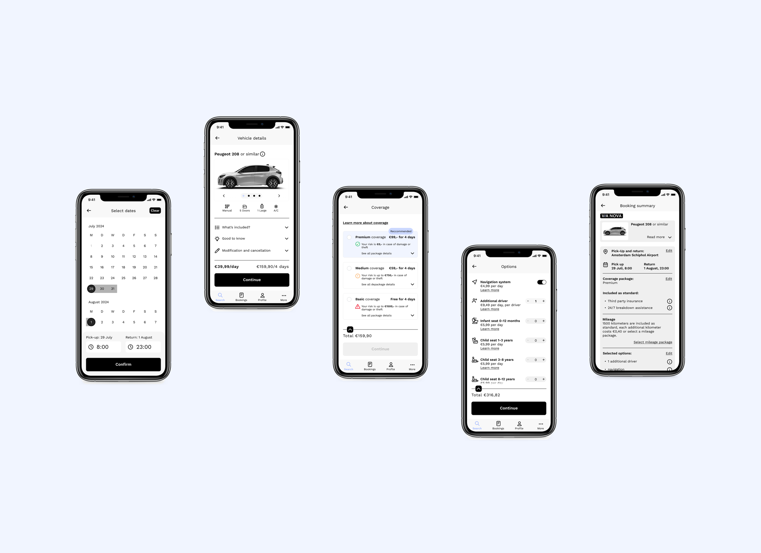
Reduce mileage-related decision fatigue by offering a sensible default, with the option to adjust at the booking summary.
Build trust through clear guidance and honest risk framing, rather than reassurance alone.
Design process.
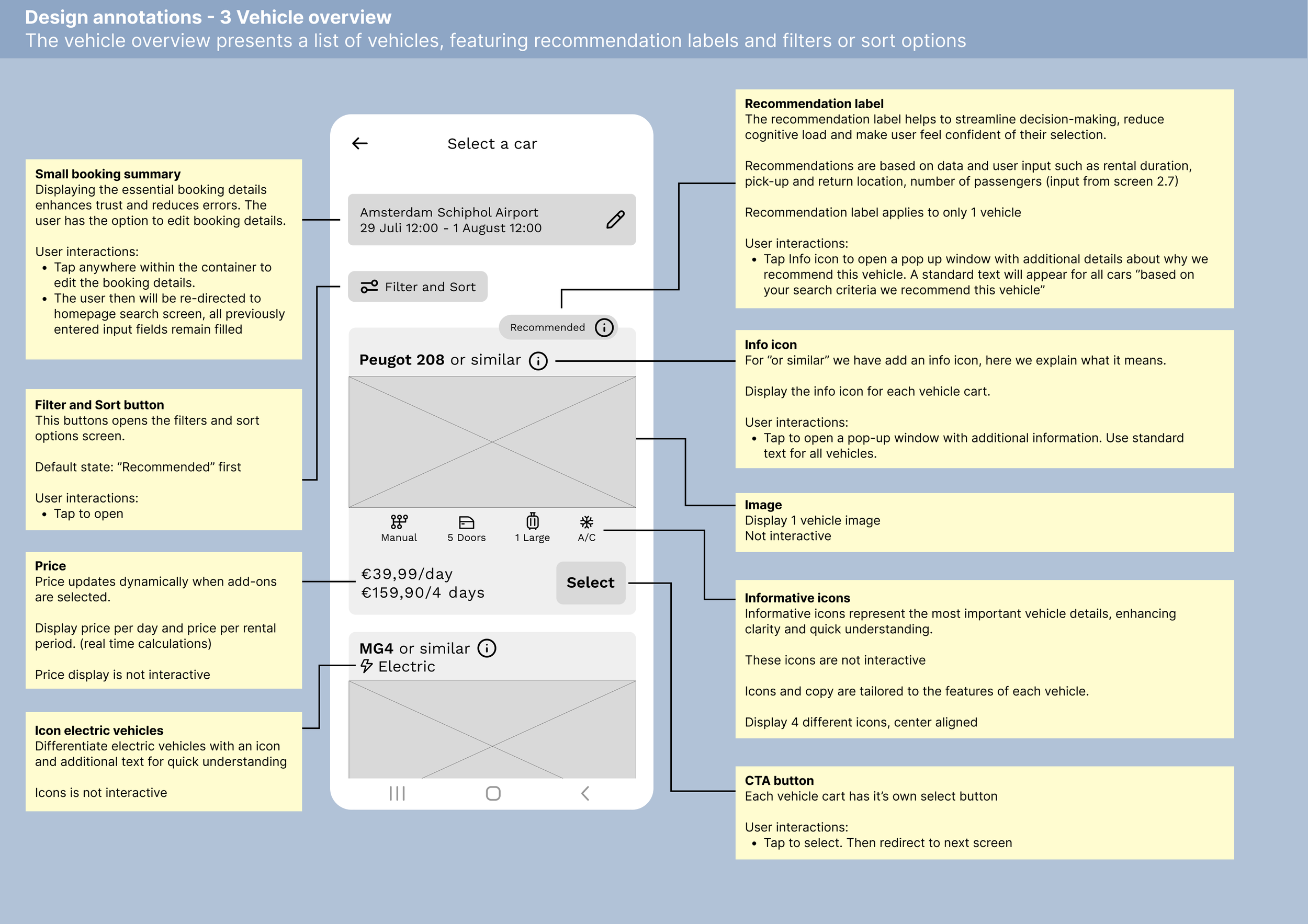
Competitor Benchmarking: Identified opportunity spaces and usability gaps, including unclear terminology across competitor apps. Terms such as "or similar" for vehicle substitutions were rarely explained, so we introduced info icons to clarify meaning at the point of confusion.
Heuristic Evaluation: Measured clarity, feedback, and error prevention.
Usability Testing: Observed behaviour and validated recurring issues, including unclear terminology and decision fatigue caused by long vehicle lists. Testing also showed users could not estimate their mileage needs in advance, so we introduced a standard mileage package covering most trips, with the option to upgrade for higher mileage needs.
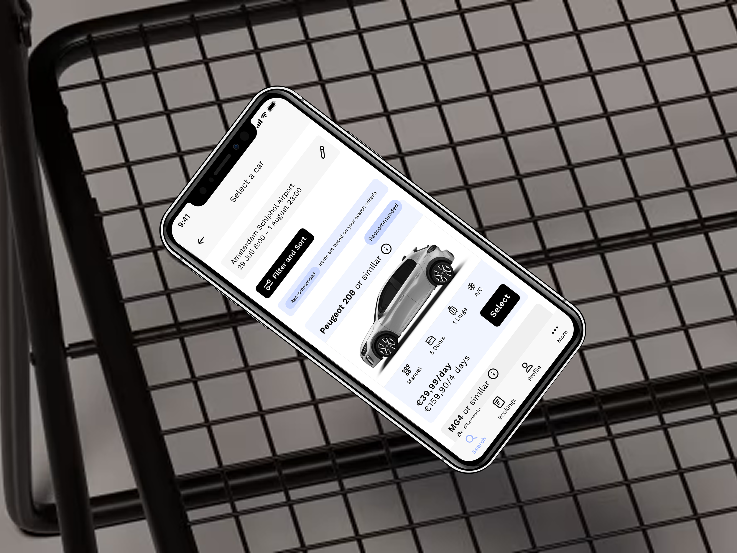
Customer Journey Mapping: Pinpointed moments of friction and uncertainty, particularly during vehicle selection, where it was unclear how results were sorted. Users hesitated between options and turned to filters, which had usability problems of their own. Using trip inputs already provided by the user, we introduced recommendation labels so users could decide with confidence without needing the filter menu.
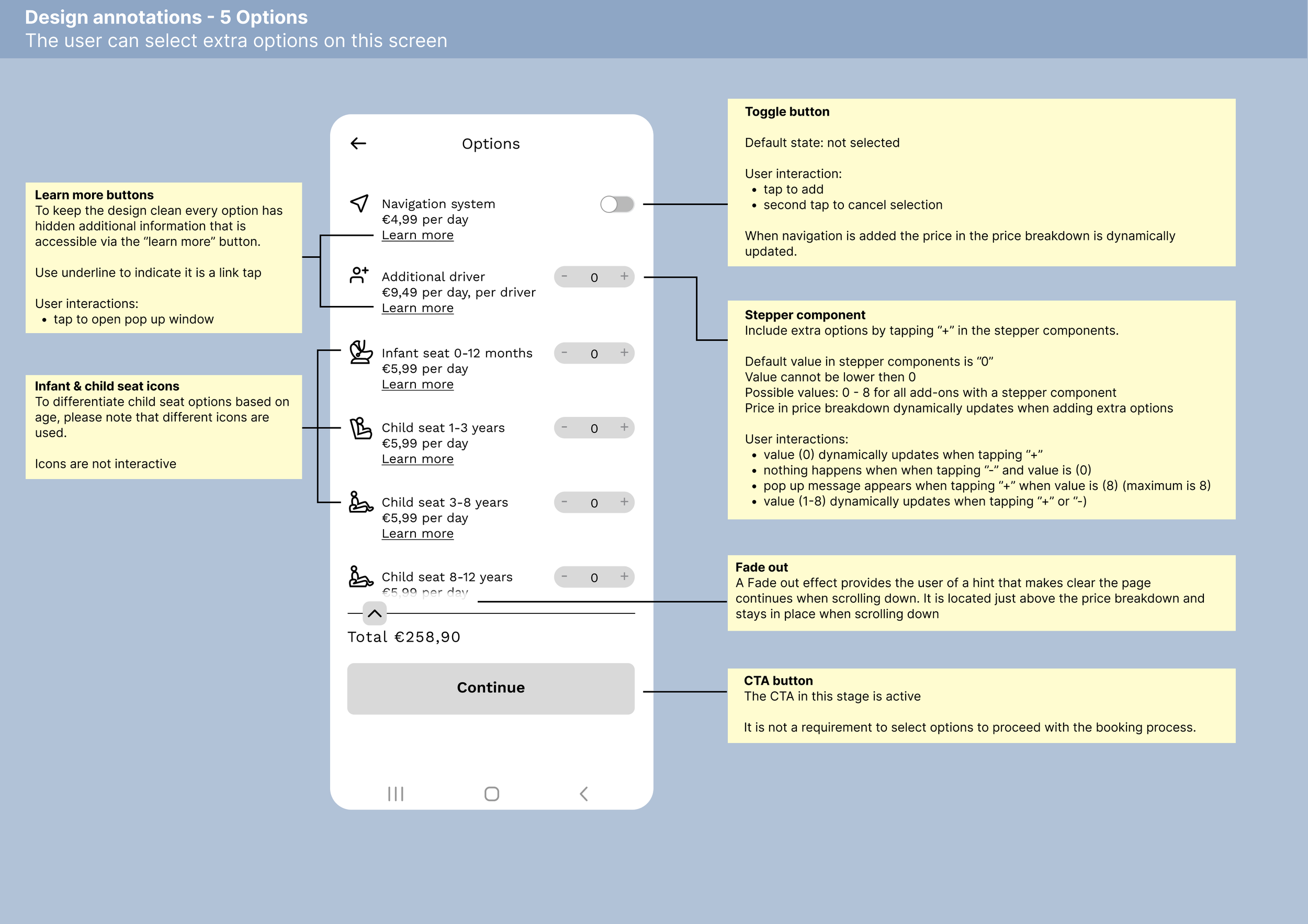
Information Architecture: Simplified and restructured the flow. The customer journey map revealed frustration in the Extras menu, where it was unclear what was already included in the booking versus what was an add-on, so we simplified the menu to focus on that distinction alone. We also found that uncertainty around mileage selection carried a risk of users abandoning the booking process, so we removed it as a separate decision point. A standard package of 1500 miles is now included by default, with the option to upgrade at the booking summary for the smaller group of users who need more.
Affinity Mapping: Clustered findings to define priorities, surfacing insurance opacity and vehicle overload as the two highest-impact problems.
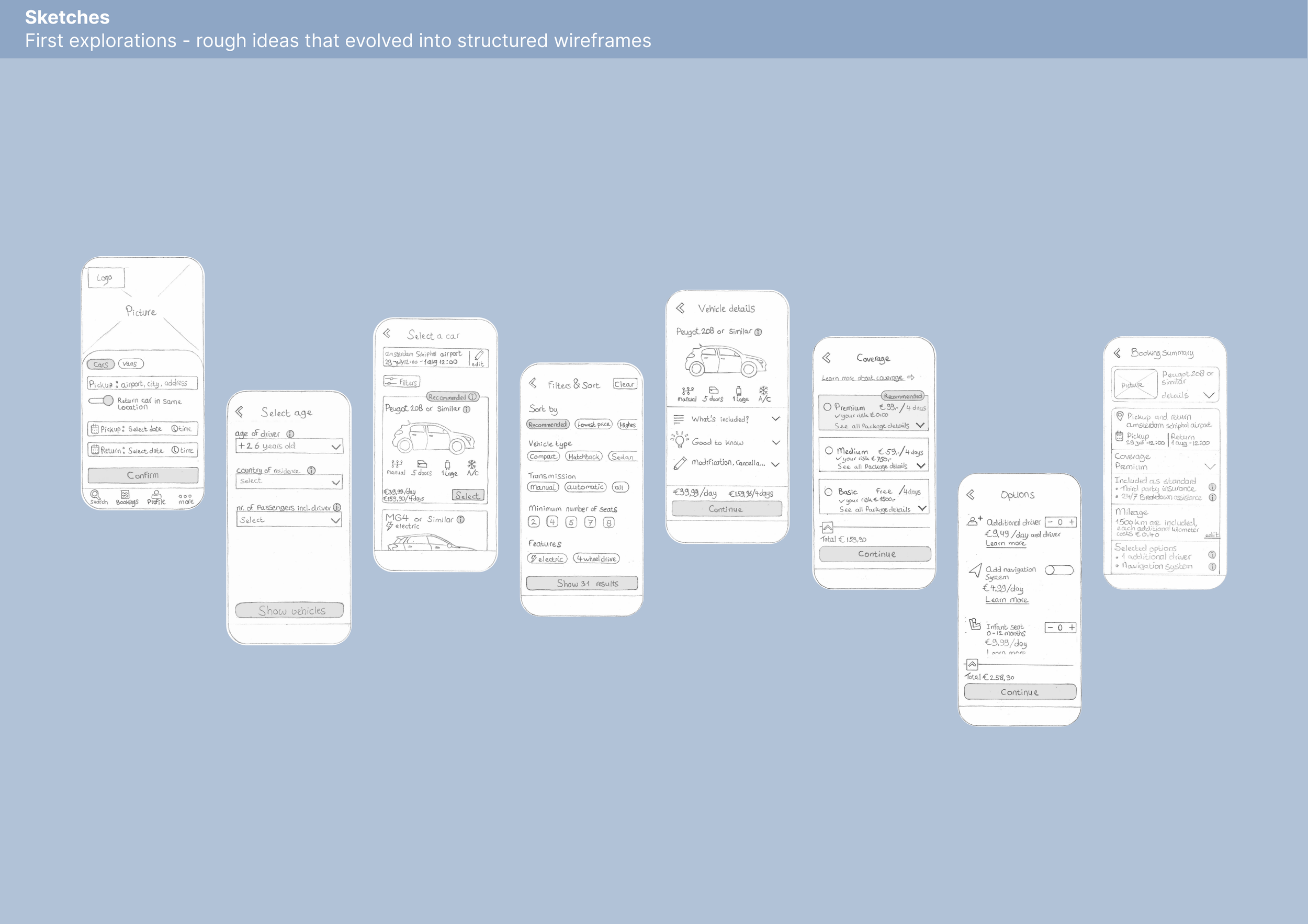
Wireframing: Explored structure and navigation through early concepts.
High-Fidelity Prototype: Developed a refined flow in Figma.
Icon Design: Created custom icons to improve clarity in the Extras menu.
Tools: Pen and paper (sketch exploration) + Figma (wireframes, IA, and prototype)
Outcome.
To reduce decision fatigue in vehicle selection, we used trip inputs such as traveler count and trip length to infer space needs and surfaced this as a recommendation label. This applies choice architecture, guiding users toward a suitable option while reducing cognitive load without removing their control.
Smart defaults were applied throughout the flow, pre-selecting the option most users were likely to need at each step. This leverages status quo bias, the tendency to stick with an already-selected option, to reduce friction while still allowing users to change their choice.
In the insurance selection screen, we applied loss aversion framing by making the financial risk of going uninsured concrete and visible, rather than presenting insurance as an optional upsell. This gives users a clearer basis for the decision and results in a more transparent, lower-risk rental experience.


Next steps + future iterations.
Further research could be expanded with surveys to validate patterns at scale and support additional segmentation. Future testing on the high-fidelity prototype would help measure whether the improvements translate into increased confidence and faster decision-making.
Additional refinement around accessibility standards would ensure a more inclusive booking experience.